Naturally Unnatural

I came across an unnatural picture on where else but Pinterest the other day and naturally I was drawn to it. Soft colours, whimsical creatures, earth conscienceness, and the pull of false science had me clicking through about at least a hundred links until I finally found the original source of the image, Leontine Greenberg.

Leontine’s inspiration is self-defined as by “the coming environmental apocalypse” which leads me to suspect is what her new show Unnatural Selection is all about. This two-person show along with Lou Pimentel, that features Leontine’s crazily adapted critters struggling to survive in the ever-changing and encroaching man-made world around them.

I’m very inspired by the combination of  feminity and steam-punk. Soft colours, organic shapes, flowers, and ink spots decorating the page seamlessly interact with the fantasy of the detailed insects and birds making their way through the world by means of wheels. Ok so the ‘machines’ aren’t quite steam-powered but they are a great combination of science and fantasy.

The show runs until July 29 so I see a problem posting a lot of full illustrations until after that date. If you live in NYC I would just go on over to My Plastic Heart Gallery and see these in person. Or check out more of Leontine Greenberg’s work at http://leontinegreenberg.tumblr.com/.

All My Friends Are Dead

I set out Saturday afternoon for the Vancouver Aquarium with Kasrah, who would have thought that 1pm on the Saturday of a long weekend of the first weekend after school is out for the summer that the aquarium would have been so busy…

Hmm…Maybe we’ve been out of school too long if we couldn’t figure that one out. Anyways, we skipped the insanity in favour of lunch and shopping along West 4th. Much better idea. After gorging ourselves at Las Margaritas we decided to walk some of the stomach cramps out and stumbled into one of those kitschy stores that are great for buying presents for those people who don’t need anything. As it turned out, I bought no presents for others, just for myself! Among those presents was the book All My Friends Are Dead. I read the whole thing in the store and got quite a few good laughs out of it. I could have left it at that but decided I should thank the artist and writer by buying the book. It’s now sitting on my coffee table so that all my alive friends can come over and enjoy it too.

Super simplistic illustrations, personified objects with quirky expressions, sarcastic comments, dry humor…what more could you ask for in a book? And what grown-up doesn’t love the chance to read an illustration book? Especially if it’s meant for grown-ups. No honey this is a grown-up book, I know if looks like your books, but it’s not. It’s mine.

Cover Page

Dodo Bird

Expired Milk

Plants

Best Friends

Not Best Friends

Probably not the usual sort of coffee table book full of scenic travel photos or life quotes, but definitely more enjoyable! Check out All My Friends Are Dead for more peeks into this book and the sequel.

Tagged , ,

Winter Wine Wedding – Invite Preview

It’s very nerve-wracking for me to design something for a friend or family (then why do I do it so much?!). I think the hardest part is they think oh I’ll ask Kylie to do this for me, she can do it no problem! Ok so that’s the flattering part, the hard part is that they already have built up in their minds what they want and a lot can be lost in translation when it comes out their mouths–and this can get even more muddled if they try to draw it out. And I guess that’s not even the hardest part, the hardest part is now taking that sketch and re-drawing it myself, designing it on the computer and then presenting my design to someone. This is where my nerves start jumping, was I able to take what we talked and sketched about out of their head and into my computer?

Case in point, Sarah’s wedding invites. I was so excited to help her have beautiful, custom invitations instead of some cookie cutter design from Staple or Michael’s. We looked at samples online extensively, had many brainstorming sessions over a glass or two of wine and eventually came out with this sketch:

Which then became this sketch:

Which turned into this computer sketch:

I told the bride she would see a computer sketch on Friday, and then I got too nervous and did some more versions and finally sent a couple to her on Saturday. Then I waited…

A couple nervous hours went by until I got this text

I LOVE the invites!!! Danny isnt home but I can’t wait to show him.

Phew! There is definitely more tweaking to be done on my part, and quite probably on the bride and groom’s part but we have a solid base and I can’t wait to see the finished product printed on lovely paper!

I looked at a ton of vintage ski posters trying to get an après-ski influence but in the end what inspired me most was this beautiful illustration from www.onedove.ca.

I love the sketched look of the waves and especially how the images are the negative part of the design instead of being the parts in colour. I tried that with Sarah’s invites but it didn’t work as nicely for me. Instead I chose to go with purple imagery and the champagne colour is hopefully what the paper colour will be. Originally my design had a tree in it as well but on second thought I took it out and am so much happier with the result. I love white space in design which is a big reason I love onedove’s work so much. The light texturing put into the Pray For Japan illustration appeals to me as well but I’m hoping Sarah gets some nice textured paper that will do the work for me!

Speaking of working for family and friends, I’m off to update my mom’s website for the last time this school season…

Tagged , ,

Pop of ‘Puffs

Need a pop of colour in your spring wardrobe? How about a Pop of ‘Puffs?! I was very excited to open my email recently and see the newest release of a Creampuffs photo shoot prominently displayed!

As amateur set designer and accessory assistant I had a lot of fun with this one. GG’s wonderfully playful mind wanted some spunky Rihanna-esque style to this shoot and I had this awesome vision of our model floating on a cloud of balloons. We were blowing up balloons (thankfully with the help of a machine) and I kept thinking more, we need more! I’m not sure anyone agreed with me until we trying attaching them together in a “cloud” shape. What a mess that was! Eventually they were strung together and laid out around a table. The table was draped in white to blend in and piled high with balloons. I gotta say I was not entirely impressed with the floral background but you gotta work with what you have, and I am pleasantly surprised with the result! It’s like Rihanna, the Little Mermaid and Up and combined into one pin-up shoot! This one has GG and Creampuffs written all over it!

Check out more Pops of ‘Puffs at www.creampuffbygg.com.

Tagged ,

Winter Wine Wedding – Invite Inspiration

My last blog was about the colour palette for Sarah’s wedding, which I hadn’t known had given her a mini bride heart attack when I said the colours would define the rest of the wedding…whoops! Sorry Sarah! But it all worked out, we have a colour palette and now it’s time for something to be drawn in those colours.

We first turned our attention to some invites the Bride and Groom had seen online and were attracted to. It was my job to pull out of them what they actually liked about each invite. “I dunno, it’s just nice” doesn’t cut it for me–Nor would I settle for the word “pretty”.

I love how the text block is offset to one side, the spouses to be loved that it was this was a ski pass themed invite without being too over the top with the theme. They were also attracted to the typography of the date.

These three were selected for their fun cursive typefaces, nothing over the top and illegible, just nice and curvy!

This beautiful wedding set was chosen for the shared love of purple, as well as the use of the wine glass stain.

And finally, if I wasn’t around I think the bride and groom would be totally happy with this wedding set. The illustration style, type set into a defined block and simple colour palette work wonderful together–and it doesn’t hurt it’s a mountain theme as well! Now my challenge is to come up with something that will blow this one out of the water–or off the mountain!

Tagged , , , ,

Winter Wine Wedding – Colours

My best friend is getting married in Sun Peaks next year and we’re busy racking our minds trying to come up with a way to combine her wine theme with the mountain. A wine theme–now that’s my kind of wedding! Even better I get paid in wine to design her invites!

So the big question is how to design an invite that has snow, mountains, and wine elements that is cohesive. Ice wine, frozen grapes, après ski; these are the images that came to mind. So let’s start with a colour scheme. The bride is set on a dark purple for the bridesmaids’ dresses so that’s the main colour. Now for some colours that will bring the winter wine theme together with the purple. To help inspire some frozen colour ideas I found a great ice wine picture and pulled some cool colours from there. The result is a winter colour palette that has wine coloured undertones and a champagne colour that was taken from the sash on the bride’s gown.

Now with the hard part figured out we turn to the actual invites. Hmmmm, on second thought maybe the colour scheme was the easy part…

Tagged , , , ,

Personal Robots

After being inspired by the robots in Machinarium that I blogged about yesterday, I decided to sketch up a couple of my own. The first one is supposed to be me; with a roller as feet she’s fast but a little unsteady on her “toes” and as such tends to be clumsy. She also has a paint can hat that has inadvertently decorated her head and body. And the glasses help her poor junk yard eyes see better, plus they double as fire starters!

I also made a mate for my robot to reflect my real beau. He is very smart as you might be able to tell by the (energy efficient) light bulb illuminating the top of his shiny domed head. Springs for legs allow him to jump to great heights and bound forward at lightening speeds. He has long monkey arms that I worry would get caught up in his spring legs so these arms have an adjustable length!

{Excuse the poor cell phone photos of my sketch book but I plan on jazzin’ them up in photoshop anyways!}

Tagged , ,

A friend sent me the link to a point and click game called Machinarium, now I’m not a gamer. In fact-the only game I’ve ever played on the computer is Spider Solitaire, unless you want to count Oregon Trail in elementary school. This link was sent to me not for the game, but for the visual arts in the game. A small Czech Game Development Studio called Amanita Design, designed Machinarium and won an Excellence in Visual Arts award in 2009 in the Independant Games Festival.

First off, the game is centered around Robots! If that’s not enough to peak your interest, the whimsical sketched style and soft colours should do it for you. I love the contrast your mind creates because robots are “supposed” to be hard, shiny, mechanical, and maybe flashy. Soft, muted colours along with dark lines create this sort of underworld feeling while the main character is this cute little misfit robot. The animations are simple but the little shrugs the robot can give you or the toe taps if you’re taking too long add to the cute-ness. And I know the word cute isn’t a great way to describe something but I honestly think it can be used in this case. Ok, I’ll try to describe it better, how about Dr. Seuss combined with Rube Goldberg combined with the movie 9. More accurate or more complicated?


I’m not sure if there is a winter-time level but I found this pic on the web advertising a Christmas Sale. I wonder if robots rust in the snow? And if they do do you have to avoid the red spots instead of the yellow ones in the snow?!

And while it took me forever to figure out the first level, it did get addicting and I’m contemplating buying the whole game now that’s I’ve passed all the demo levels. Ahem-but only for the inspirational art, I swear! Check it out at www.machinarium.com or check out Amanita and their other games at www.amanita-design.net/.

Actually, maybe before I buy it and spend all my time trying to beat the levels I will try to create my own personal robots!

Robotic Whimsy

Tagged , , , ,

Loving the Baby Bump

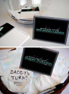
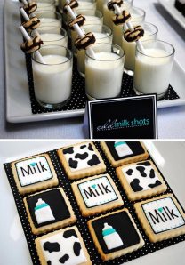
Friends of mine just had a baby boy so I’ve been scouring my new favourite website Pinterest for DIY baby shower gifts. Following this cute Ready To Pop Picture I was taken to the Bump Smitten Blog of baby shower inspirations. What’s better than a baby shower? A themed baby shower! And while there are many themes, this Milkaholic party really appealed to my graphic designer side. Not only is it totally DIY but there is typography and packaging involved! So what’s better than a themed baby shower? A themed baby shower with amazing signage, typography, and packaging!

I am always drawn to mixed types, and the typeface of the milk party “logo” is incorporated well in other areas along with some cursive.

The milk theme is represented a few times with the cow print but is also present in a newer and less country way with the polka dots and even stripes. The black and while lends itself well to either sex, the blue could easily be pink or even yellow or green if you didn’t know the sex yet.

Having some fun by playing with the notions of the ever-present alcohol at parties is tastefully done at this party where the mom (and maybe some other young party guests) would definitely not be drinking.

Find other great baby shower themes at http://www.bumpsmitten.com/.


Tagged , , , ,

Wrapped in Foil for the Holidays

OK little braggin’ moment here. My sister was in her first newspaper ad! Creampuff creator GG Endean has a line of dresses called Foil out in time for the holidays, and what holiday dresses they are! Ali looks amazing in her first professional photoshoot, doesn’t she?! Little holiday ornaments were used at props (and were in turn used as decorative drawn touches in the ad). The ad itself is fun, young and flirty perfect for a holiday party with the girls! I got to exercise my creative brain bits with some styling of the jewelry, props and shoes–even used a pair of the shoes I wore to the shoot! The ad debuted in today’s issue of the North Shore Outlook and the dresses can be see in Favourite Gifts at the Lonsdale Quay Market.

Congrats Ali!

Tagged , , ,